SupportUkraine
If you experience any problems with the forum (it is not visible, there is no way to post messages, or some functionality does not work), please let us know. If you have problems with registration or you did not receive confirmation letter, let us know and we will activate your account manually.
If you get an "The submitted form was invalid. Try submitting again" error, delete cookies, then try again.
Ad blocker detected: Our website is made possible by displaying online advertisements to our visitors. Please consider supporting us by disabling your ad blocker on our website.
Forum rules
When adding a new topic, use the template: Topic title [device name]
For example: Screen timeout question [GTR 3 Pro]
All communication in this branch should only be in English.
Hey guys. I was wondering if someone compare screens between two watches because in my case I see that Screen in GTR3 is more fluid nicer colors but it lost some clarity and sharpness
I was wondering that it's some kind of defect of my watch or this is normal
When I compare the same watchfaces with used the same best quality png files for especialy numbers are softer like it's used some kind of FXAA filter for image oin GTR3 PRO.
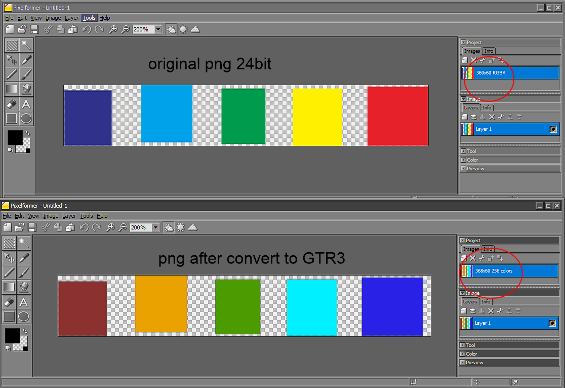
I'm not sure about the image quality, but the GTR 3's png file appears to be a 256-color optimized TGA file format, but it appears to have a specific color rendering configuration based on the GTR3's format. This may be one of the reasons for the lost some clarity and sharpness
So when converting the GTR3's PNG back to a normal PNG, the color scale is also 256 colors, even though the converted file is 24 bit.
Which I'm not sure if I understood correctly or not but from my testing it shows like that.
Spoiler
ͼͽ To request please use the interrelated forum in action ͼͽ
Please do not PM to me for requests ported watchface.
I'm not sure about the image quality, but the GTR 3's png file appears to be a 256-color optimized TGA file format, but it appears to have a specific color rendering configuration based on the GTR3's format. This may be one of the reasons for the lost some clarity and sharpness
So when converting the GTR3's PNG back to a normal PNG, the color scale is also 256 colors, even though the converted file is 24 bit.
Which I'm not sure if I understood correctly or not but from my testing it shows like that.
Spoiler
Yes I notice this also @asso when I convert watchfaces with bigger pallete or smooth color grading they look not so good on watch. Anyway I'm thinking that GTR3 PRO (maybe GTR3 too) have some kind FXAA filter applied to image, because most of small elements of fonts dosn't look that sharp like in GTR2 in comparision.
Everything is softer and even when I apply agressive sharpness filter on gimp to background or other elements or fonts in almost all my converted WF's it's looking better on GTR3 like normal image without filter but On GTR2 the same filtered image look waaay too sharp and you can clearly see overblown edges
When I tested your GTR3 PRO conversion of some faces they are blurry on watch, so if you want you can apply some sharpness filter in future conversions
Cheers
A small font is hard to read while on the Gtr and Gtr 2 there was no problem.
Is it possible it has something to do with the brightness that gets pumped up (400 vs 1000 nits max)?
Just a guess .
I think this is some kind of antialiasing filter but this is my guess only. When I saw this first time I thought that my GTR3 Pro have some kind defect but when I saw another GTR3 PRO in store display it looks the same. Seriously I don't know why Huami use this effect on screen because it have better resolution and ppi.
Also why Huami decide to not use normal png files but different format that have worse quality and color pallete after converting
Maybe in future we will be able to change this or modify firmware to resolve that issues....
It's shame because GTR3 Pro is great piece of hardware and Huami made few big steps foward compared to GTR2 but unfortunately they made few small steps back
I just bought Amazfit Gtr 3 pro after a month of search and watching reviews. I received the watch today and I have this same issue the display feels like a cheap lcd panel,no crisp and sharp image.
I am extremely disappointed,money wasted over a cheap display, was hoping I would get a good display for such a high price but no I was wrong.
What is this issue? Amoled display are supposed to be really good. Does the Amazfit gtr 2 new version also has this issue?
Users browsing this forum: No registered users and 1 guest
Cookie Consent
This website uses cookie or similar technologies, to enhance your browsing experience and provide personalised recommendations. By continuing to use our website, you agree to our Privacy Policy





 .
.