Page 1 of 1
Request for designers of watch faces[Balance2]
Posted: 25 Jun 2026, 06:24
by Shingela
MarioLie wrote: 08 Jun 2026, 18:37
Shingela wrote: 04 Jun 2026, 10:03
Been using community faces for years and I love the work you all put in, but I want to ask why most (pretty much all) choose to include the same parameters.
For example i often see moon phases (for werewolves?) air quality (not sure if this is useful for anyone not living in a smog factory?) humidity (for girls with certain hairstyles?), UVI (vampires?) etc
And I often find missing useful parameters like spo2, pai (week/day), BC (now HC) etc
Not sure how most people use their watch, I’m no runner but decently active since I’m a nature photographer. So bike, hike and walk a lot
Am I alone in valuing stuff like spo2/pai over the stuff above? Because like 1% of the faces have them
Hope to get some clarity on why this is the way it is, I’m also looking to learn how to make faces myself soon since I’ve tried to message several creators and asking to pay for some custom changes (like switch parameters) on their already great designs but none seems interested
Tell me your idea regarding the content and colors, and I’ll make it for you. I also don’t understand designs where a person has to spend two minutes orienting themselves before they find the right piece of information.
Wow that would be amazing!
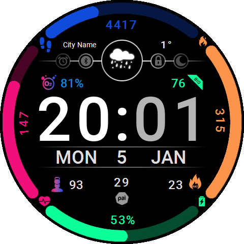
I like aesthetically nice ones, that’s useful, easy to read still and not too cluttered (small numbers). The one I’m using the most atm is this;
https://amazfitwatchfaces.com/balance/view/3106
And it’s really nice with the titanium and orange strap I’m using now. I would love to remove the uvi/aqi/hum/ and add spo2, bio/hybrid charge and maybe hrv/stress/fatburn minutes as the last.
Another one I was using is these styles;
https://amazfitwatchfaces.com/balance/view/5291
Also really nice but missing the above values and weeks start with Sunday instead of Monday (not a biggie but still)
I would be happy to pay for designs and modifications, and I’ve also messaged many designers here but usually no replies or interest.
Re: Question for designers of watch faces[Balance2]
Posted: 25 Jun 2026, 06:29
by Shingela
SashaCX75 wrote: 24 Jun 2026, 20:56
Humidity and UVI fluctuate constantly, whilst for most people, SpO2 does not go beyond 97–99%. Furthermore, not everyone even has SpO2 measurement enabled. So why add a metric to the watch face that won’t be displayed for everyone?
There are workout screens for training, and the metrics displayed on them are relevant to that specific workout. The watch face, however, is for everyday use.
What’s more, everyone has different preferences. Some people like to display as many different metrics as possible on the watch face. Others don’t need so many, but want them to be large. And for some, the most important thing is an attractive design.
Of course people have different preferences, and it’s good with options. BUT - look at the stuff being put out, it’s 99% the same identical values.
And I’ve yet to hear a good point for some values, please enlighten me on these:
For example i often see moon phases (for werewolves?) air quality (not sure if this is useful for anyone not living in a smog factory?) humidity (for girls with certain hairstyles?), UVI (vampires?) etc
And I often find missing useful parameters like spo2, pai (week/day), BC (now HC) etc
I also value nice, good looking designs, and they have to be easy to read when you are active. But many ”design” ones are too cluttered with useless (to me) info and hard to make out while I’m riding down a mountain on a bike or in a tree trying to snap pics of a bird etc
Re: Question for designers of watch faces[Balance2]
Posted: 26 Jun 2026, 05:50
by MarioLie
Shingela wrote: Yesterday, 06:29
SashaCX75 wrote: 24 Jun 2026, 20:56
Humidity and UVI fluctuate constantly, whilst for most people, SpO2 does not go beyond 97–99%. Furthermore, not everyone even has SpO2 measurement enabled. So why add a metric to the watch face that won’t be displayed for everyone?
There are workout screens for training, and the metrics displayed on them are relevant to that specific workout. The watch face, however, is for everyday use.
What’s more, everyone has different preferences. Some people like to display as many different metrics as possible on the watch face. Others don’t need so many, but want them to be large. And for some, the most important thing is an attractive design.
Of course people have different preferences, and it’s good with options. BUT - look at the stuff being put out, it’s 99% the same identical values.
And I’ve yet to hear a good point for some values, please enlighten me on these:
For example i often see moon phases (for werewolves?) air quality (not sure if this is useful for anyone not living in a smog factory?) humidity (for girls with certain hairstyles?), UVI (vampires?) etc
And I often find missing useful parameters like spo2, pai (week/day), BC (now HC) etc
I also value nice, good looking designs, and they have to be easy to read when you are active. But many ”design” ones are too cluttered with useless (to me) info and hard to make out while I’m riding down a mountain on a bike or in a tree trying to snap pics of a bird etc
I'm already working on it